More often that not, my desk is my pocket. But everyday desk items doesn't have the same ring.
I thought about a dislike. You do not have a 66 to actually compare the pens, to call it a clone or a knock-off (not the same) based on photos is a reach. To suggest that Moonman looks around the world for low volume hand made pens to copy is pure conjecture. The pens share features as many pens do. It emulates a 66 in some of those features. There are only so many designs for pens. I will have a C2 soon to appreciate what it is. I will compare it to a C1, M2 & Lecai.
Perhaps the most difficult review I've written. Over-reaction? Perhaps, but it's very hard to ignore what appears to be an elephant in the room. It was incumbent on me to share what I'd discovered. I felt it would be irresponsible not to.
Yes. Clone and knock-off are different. It's not a knock-off like a fake Rolex. I'll updated the review accordingly.
But, to be fair, beyond photos I also looked at dimensions. The more I drilled down, the clearer it became that they are really, really close. If you still have the P66 in your collection that you reviewed in in early 2017, you'll be in a position to make a direct comparison.
Actually, I do believe Moonman targets specific markets and they survey best-in-class products in those segments. I think the P66 was chosen because it is such an elegant design for a segment Moonman wants to cover. I have to believe that what they did was deliberate and knowing - a shortcut that I don't think reflects well on their brand.
If you look for pens inspired by you'll see a lot on both sides. Sailor & Montblanc is one. If you look at other commercial products you see it; automobiles, movies, etc. Stating that you know why & how a product was developed is an amazing talent. I spent a good part of my career in product development & I wouldn't try.






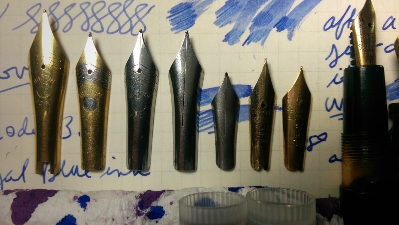

Moonman continues to explore new ways to incorporate their #6 nib into new pens. The most recent example is the Moonman C2, a refresh of the popular M2 eyedropper-only pen.
Spoiler Alert! The Moonman C2 is an obvious copy of the Franklin Christoph Pocket 66.
The pen accomplishes a couple of things:
On the last point, Moonman has also hedged their bets and makes the C2 in a second configuration with their smaller #5 nib. This may be a first: a pen sold with either a #5 or #6 nib!
Image: Taobao
A ‘Fresh’ Design
The design of the C2 feels modern. The Moonman branding engraved at the base of the frosted bottom half of the cap is subtle. The matching thread patterns inside the cap and barrel add visual interest. It reminds me a bit of what TWSBI is doing with the GO!
The pen is produced in bright red and blue along with clear and a purple they call grape. Priced at under US$12 (plus shipping) on Taobao, the cost is near impulse-buy territory.
The C2 is the least expensive Moonman pen to feature the new Nº 6 nib.
The product page shows the pen in contemporary settings with fruit, fashion and art. Think yuppies with half a nod to women. Moonman is trying to broaden its appeal.
Images: Taobao
That Pocket 66 Issue
The resemblance to the Franklin Christoph Pocket 66 is impossible to ignore. The Moonman C2 is the spitting image, down to the chamfering on the ends.
I wasn't familiar with the Pocket 66 until I started research on the Moonman C2. In fact, when I first saw the C2 I thought it might be something like the long-lost Karas Kustoms Vertex. Nope, not the Vertex.
Images: Pen Addict
Franklin Christoph has now removed the Pocket 66 from regular production and makes it only in special editions. Moonman doubtless sees this as an open segment in the market. Of course, the Pocket 66 retails for around US$150 and the C2 is less than a tenth of that.
Still, it's more than a little disappointing to see Moonman copying a design so blatantly. Kudos to PenBBS for not going down that path.
Or does Moonman have a licensing agreement for the design with Franklin Christoph? That would be interesting, but I've seen no indication so far.
The Moonman C2 solves some of the problems that nag the M2. Moving the threads to the front of the section does away with the cross threading my M2 persistently exhibits. The cap now posts deeply and very firmly. It goes on and off in 2½ turns. Oh well.
The Moonman C2 does have its own idiosyncrasies. The step behind the section is noticeable and sharp. It would have been nice to smooth this a bit. The M2 solves this by having a metal ring in between the cap and the barrel. The C1 is that respect is a step backward.
Then there's the noise. When I first took up the pen after filling it and fitting the section, I found the section oddly loose. Pressing down with my thumb with the pen in the crook of my hand caused the section to creak and shift. Tightening the section helped but doesn't solve things completely. The pen is is something of a fidget toy: rotate-flex-creak, rotate-flex-creak, rotate-flex-creak.
The parts of the pen are beautifully polished. There are o-rings on the bottom of the section and the top of the nib assembly to keep the pen sealed. The nib assembly comes apart easily.
In the Hand
Like the Moonman M2, the Moonman C2 is almost too short to write with unposted. Posted, the C2 is a comfortable length - and it posts much better than the M2. The section is an hourglass shape similar to the Moonman C1, compared to the straight taper found on the M2.
Even with the sharp step, the Moonman C2 still wins out over the M2 on ergonomics.
The Moonman C2 is an easy pen to like. The section is on the small side and the step is always there, but the pen has enough girth and is nicely balanced. It's light so feels agile and friendly.
The #6 nib fits the pen well and performs flawlessly. I can understand why Moonman wanted to get yet another pen with this nib into the marketplace.
Moonman C1 and C2: Desk vs. Pocket
As a pure writing instrument, the Moonman C1 still comes out on top. Both pens are about the same weight (the C1 is 0.08g heavier inked) but the C1's larger and longer section make the C1 feel more substantial. Visually, the Moonman C1 is art and that doesn't hurt either.
So it really comes down how you'll use the pen. Do you want a pen for your desk or one for your pocket?
Conclusions
As much as I like the Moonman C2 and the idea of having an attractive, low-cost pocket pen that uses the excellent Moonman #6 nib, it's disheartening that Moonman chose not to go with an original design. Other Chinese pen makers are moving in that direction and there are plenty of designers out there who'd love to show off their chops.
But that's not what Moonman elected to do. I was expecting different. It would be great if Moonman ended the C2 with the pens they've already produced and moved with deliberate speed to a different design for a friendly pocket eyedropper to show off their terrific nib.
Or they could join forces with FC to produce an authorized version and bring a budget-friendly version this great pen to an even wider audience. In Coke bottle green. Wouldn't that be something.